Building with Components
Note: This documentation is for the old 0.3.0 version of A-Frame. Check out the documentation for the current 1.8.0 version
Fork the 360° Image Gallery Boilerplate on GitHub.
Let’s create an example of building a scene using an entity-component-system workflow. This guide will introduce three concepts:
- Using the standard components that ship with A-Frame.
- Using third-party components from the ecosystem.
- Writing custom components to accomplish whatever we want.
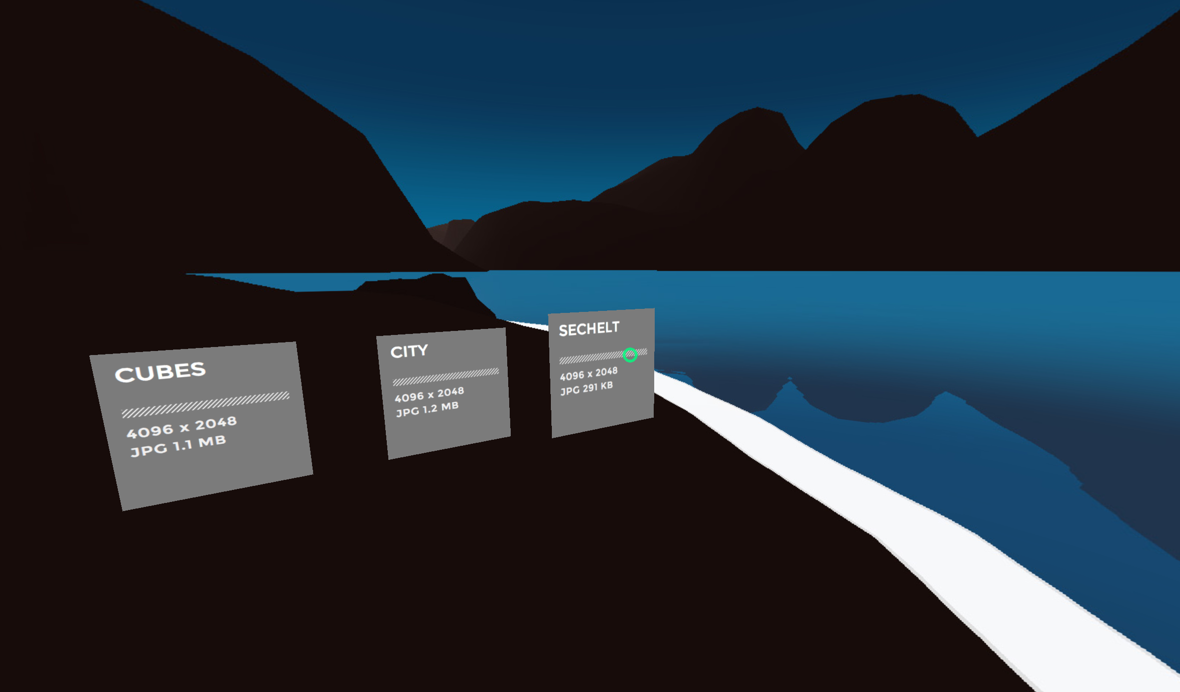
The scene we will build is a 360° image gallery. There will be three panels which the user can click on. Once clicked, the background will fade and swap the 360° images.
Skeleton
This is the starting point for our scene:
<a-scene> |
We have predefined:
- Several images to choose from in the Asset Management System within
<a-assets>. - Our 360° image placeholder with
<a-sky>. - A cursor with visual feedback using event-driven animations, fixed to the camera.
Using Standard Components
Standard components are components that ship with A-Frame, like any standard library. We’ll go over how to attach these components to entities and configure them from HTML.
We want to add an image texture to <a-plane> link using the material
component.
The material component is a multi-property component. To attach the material component to the plane, we set the component name as an HTML attribute:
<a-plane class="link" height="1" width="1" |
Then we the specify the component data using a syntax that resembles that of
inline CSS styles. We set shader to flat so the image isn’t affected
negatively by lighting. And we set src to #cubes-thumb, a selector to one
of the images defined in the Asset Management System.
<a-plane class="link" height="1" width="1" |
Let’s attach one more standard component, the sound component. We want
to make it such that when we click (via gazing) on the link, it plays a click
sound. The syntax is the same as before, but instead we are now using the sound
component’s properties. We set on to click so the sound is played on click.
And we set src to #click-sound, a selector to our <audio> element.
<a-plane class="link" height="1" width="1" |
Now we have a textured plane that plays a click sound when clicked.
Using Third-Party Components
We can grab third-party components from the ecosystem, drop them into our scene, and use them in our HTML. Components can do anything. By using components that other people have developed, we gain tons of power without needing to write our own code.
We’ll go through using three such third-party components: template, layout, and event-set. First, we have to include them. K-Frame is a component pack by Kevin Ngo, an A-Frame core developer, that conveniently includes all three of these components in one bundle.
To drop in K-Frame, download k-frame.min.js from the project’s
dist folder and include it in the <head> after A-Frame:
<html> |
Template Component
Currently, we have one link. We want to create three of them, one for each of our 360° images.
The template component integrates templating engines into A-Frame. This lets us do things such as encapsulate groups of entities, passing data to generate entities, or iteration. Since we want to turn one link into three, without copy-and-pasting HTML, we can use the template component.
If we read the template component’s documentation, we see one way
to define a template is via a script tag in <a-assets>. Let’s make our link a
template and give it a name using an id:
<a-assets> |
Then we can use the template to create multiple planes without much work:
<a-entity template="src: #plane"></a-entity> |
But then they’ll all be displaying the same image texture and look the same. Here is where we’ll need a template engine with variable substitution/interpolation.
Let’s tell the template component to use the popular Nunjucks
engine by specifying <script type="text/nunjucks">. The component will
lazy-load the template engine for us. And with Nunjucks, we define a {{ thumb
}} variable in the template, which we can pass using the data attributes:
<a-assets> |
The template component allows us to keep our scene clean by not having to repeat verbose code.
Layout Component
Because the default position of an entity is 0 0 0, the entities will
overlap. While we could manually position each link, we could instead use the
layout component to do it for us. The layout component will
automatically position its children to the specified layout.
We create a wrapper entity around our links and attach the layout component
using the line layout:
<a-entity id="links" layout="layout: line; margin: 1.5" position="-3 -1 -4"> |
Now our links are no longer overlapping without us having to calculate and fiddle with positions.
Event-Set Component
Lastly, we’ll add some visual feedback to our links. We want them to scale up
and scale back when they are hovered or clicked. This involves writing an event
listener to do setAttributes on the scale component in response to
cursor events. This is a fairly common pattern so there is an
event-set component that does setAttribute in response to
events.
Let’s attach event listeners on our links to scale them up when they are gazed
over, scale them down as they are being clicked, and scale them back when they
are no longer gazed upon. We are mimicking CSS :hover states. We can specify
event names with _event properties, and the rest of the properties define the
setAttribute calls. Notice that the event-set component can have multiple
instances:
<a-assets> |
Wielding components, we were able to do a lot with just a few more lines of HTML. Though the ecosystem has a lot to offer, your scenes will often require writing your own simple components.
Writing Components
The component documentation has detailed information on writing a component. The most basic component takes the form of:
AFRAME.registerComponent('component-name', { |
Update Raycaster Component
First, let us whitelist the entities that the cursor’s raycaster is checking
for intersections against. That way, the cursor will only click if something
can be clicked, and it is also better for performance. The cursor is built on
top of the raycaster component, and we can configure the
raycaster. We update the raycaster component’s objects property which takes a
selector:
<a-cursor id="cursor" raycaster="objects: .link"> |
This list will be populated once the raycaster component attaches. Unfortunately since the links are templated, they won’t be found at that time. What we can do is write a component that refreshes our raycaster when the link attaches. Here is the skeleton of our component:
AFRAME.registerComponent('update-raycaster', { |
First, we fill out the [schema][schema] so that we can pass in which raycaster to
update. We make it a single-property schema that takes a selector such that we can
simply do update-raycaster="#cursor":
AFRAME.registerComponent('update-raycaster', { |
Then we use that data to actually update the raycaster in the init lifecycle
method, which is called when the component is attached to the entity. We grab
the raycaster and update it:
AFRAME.registerComponent('update-raycaster', { |
Set-Image Component
View the full
set-imagecomponent on GitHub.
Finally, we write the component that fades the sky into a new 360° image once one of the links are clicked. Here is the skeleton for our set-image component.
AFRAME.registerComponent('set-image', { |
Now we decide what the API for our image-setting component will be. We need:
- An event name to listen to.
- Which entity to change the texture of.
- The image texture.
- An animation fade duration.
So we translate those properties to the schema:
AFRAME.registerComponent('set-image', { |
Now we set up the event listener to change the image while the texture has
faded to black. Whenever the event is emitted (in our case, a click), then the
component will trigger the animation (which is listening for set-image-fade),
wait the appropriate amount of time, and swap the image:
//... |
And that concludes our 360° image gallery.