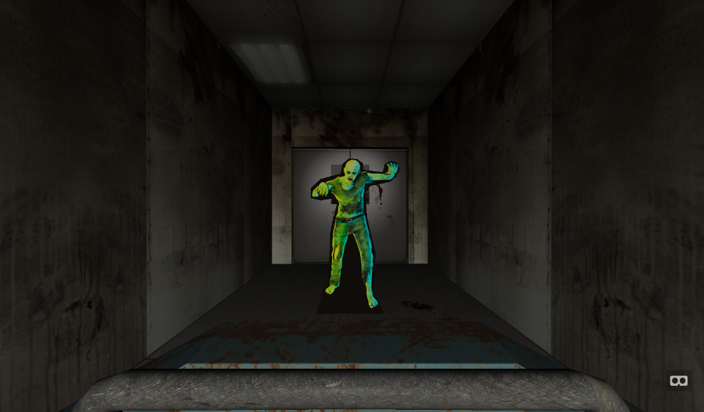
Halloween Feature! Building Ghost Train Builder
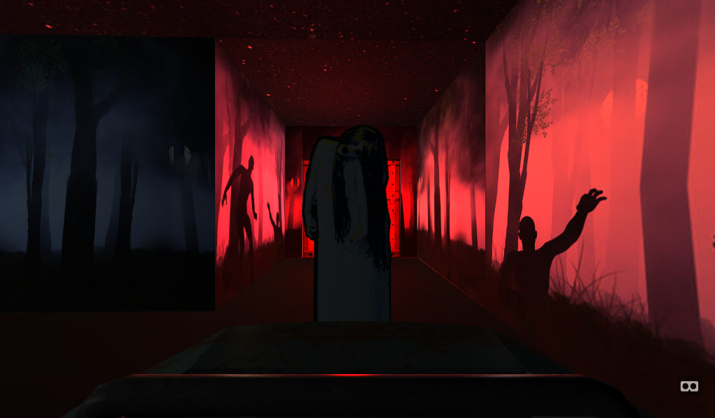
At Realise, we’re fans of working on side-projects - both to challenge ourselves and to ensure we’re getting out hands dirty with the latest technologies and able to keep taking great ideas out to our clients. The Ghost Train Builder was one such project, a site that lets you build (and then ride) your own ghost train by combining different themes (castle, hotel, etc), lighting, music and monsters. It grew from a combination or brainstorming an excuse for some halloween mischief and eagerness to do something of our with own with VR.
The original idea had actually been to have users ride a virtual ghost train and use their webcam to measure how scared they were. This led onto the thought of users making their own ghost train and competing to see who could be the scariest. This concept quickly took over from the emotion-tracking idea - we’d all seen a surge of VR games, experiences and 360 videos over the past few years, but couldn’t think of any instances of anyone giving end users the ability to make their own WebVR experience. This felt new and exciting.
Being primarily web developers, few of us had the experience or skills for building full 3D environments from scratch, and skilling up and delivering in time for halloween wasn’t realistic. This was where A-Frame came to the rescue. Being able to work with familiar HTML-like mark-up was far more appealing than programmatically plotting things in Three.js or building everything in Blender. In fact, prior to learning of A-Frame’s existence, one of our developers had previously started on his own framework, using Angular to allow XML mark-up to be used to generate 3D scenes. Using A-Frame now seemed a no-brainer.
Visuals
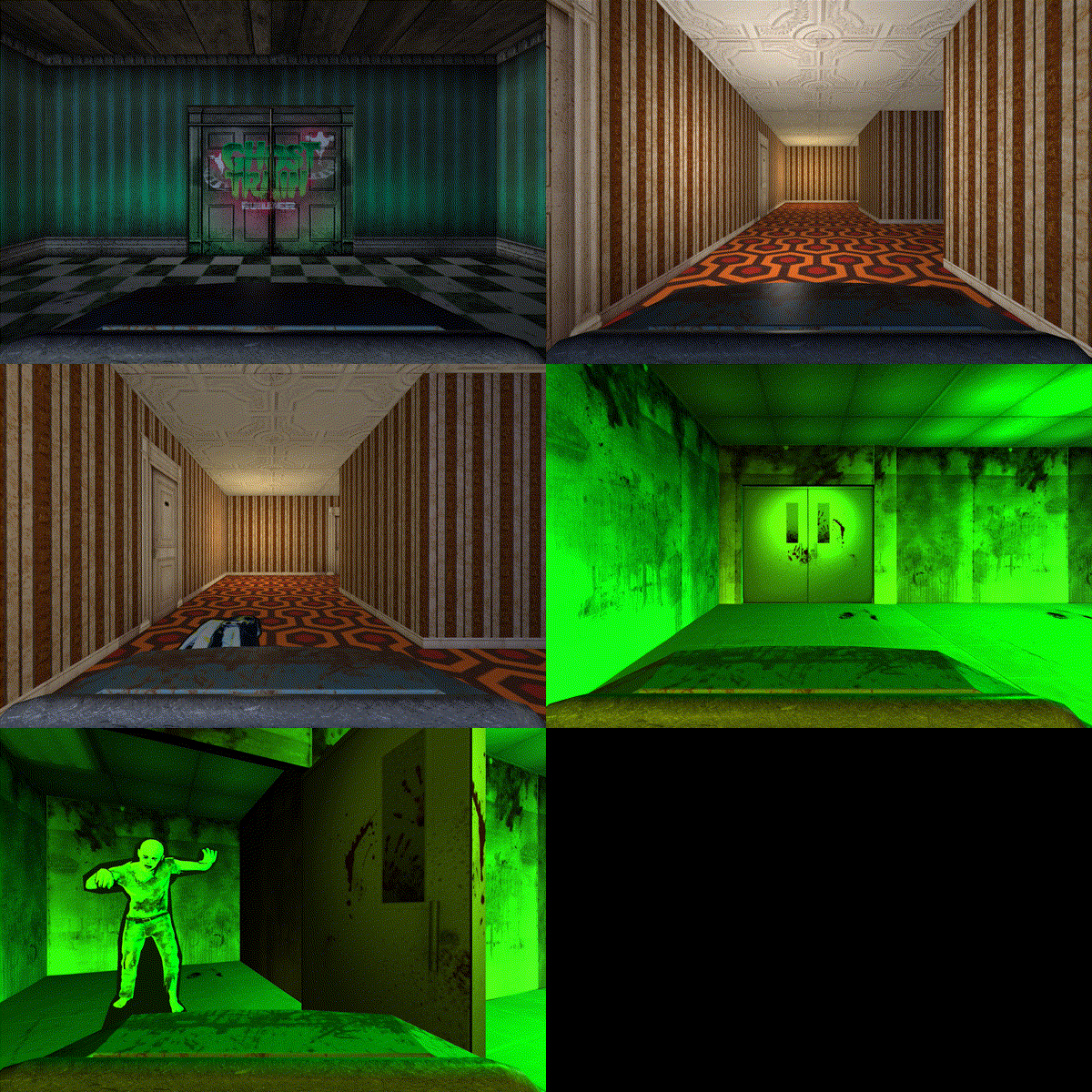
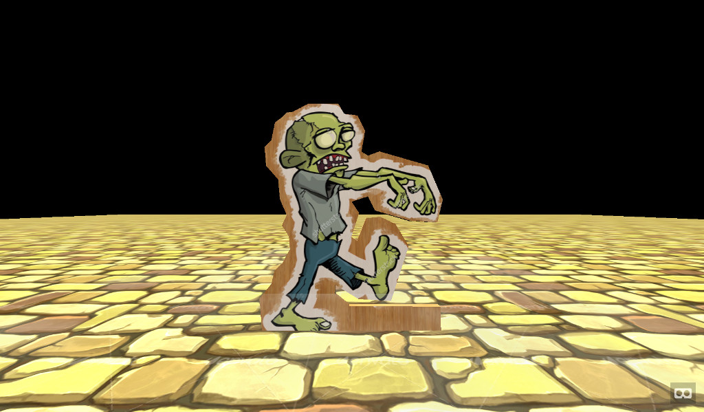
Early proof-of-concepts used flat-planes for rooms and coloured cubes for monsters. Adding lighting and pop-up animations soon followed. Our original plan had been just to purchase third-party game assets, but once we roped in one of our designers - the room textures they came up with were miles ahead of anything we mere code-monkeys had envisioned. The fact we were building a carnival-like “ghost train” meant we could build something that didn’t feel like it need to compete with a AAA console game. The walls didn’t have to complex, because in most real ghost trains they’re not (we watched a lot of YouTube videos researching this). The monsters didn’t have to be richly animated creatures with multiple limbs and hundreds of polys - flat pop-ups conveyed part of that DIY charm of these rides, that sense of feeling slightly cheated that something so basic managed to make you jump. The bounce easing on the door and monster animations really helped with this.
Implementation
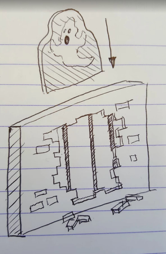
Being able to write your own A-Frame components using the underlying Three.js code, also enabled us to implement functionality we needed but hadn’t come as standard. To plot the course of the cart, we read in an array of 2D points and transitioned between them at a configurable speed. By comparing distance between entities, we were able to trigger location-specific events - the monsters popping up and doors appearing are the obvious examples of this, but later this allowed us to hide/show rooms as required, in order to avoid unnecessary rendering.
We also used Vue.js - this brought several benefits, but
the two of most interest were the two-way data-binding and custom components.
To make the ride configurable we kept all of its settings in a JSON object.
Initially we were modifying this manually, but later hooking this up to the
form for user inputs was super easy. To make the composing of rooms even
simpler than it already was with A-Frame, Vue allowed to us to make components
such as gt-door and gt-light, hiding away the full mark-up, and some bits
of logic. Late on in the project, we decided there was one room too many and
the room we decided to drop happened to be one in the middle of the ride,
rather than at end. Fortunately with everything being so componentised, this
was just a five-minute job.
Performance
It wasn’t all smoothing sailing though. Our lack of experience of building for 3D started to show when we found performance was starting to tank, particularly on mobile. We’d been merrily throwing things into this scene without consideration for the impact it would have on the processing involved. As mentioned earlier, this led us down the road of dynamically taking rooms in and out of the scene as required and reworking some of our models to have less faces - the walls were originally cuboids, which of course meant each one was bringing five times as many faces as it needed.
Lighting we found had the biggest impact though - originally we had between three and four lights in each room, which looked amazing, but was the main culprit for crashing WebGL on mobile. So on mobile devices we reverted to only having one light in entire ride, attaching it to the cart so that it followed the user and switching its colour as the user transitioned between rooms.
Conclusion
This was of course a learning experience. There’s a lot of things we would have done differently if starting again from scratch (and you know, maybe next year we will…) but it’s safe to say we’re immensely proud of the results though. When I first started in the world of web-development, about the whizziest thing you could do on a webpage was change the image on a button as the user moused over it, and today things like Ghost Train Builder are possible - no plugins, no downloads, just in the browser. These are exciting times and frameworks like A-Frame are making it even easier to be involved.
